Outside of the Hospital
Original sketch By Georgia Upton
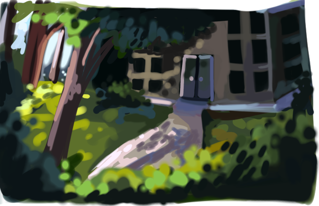
This sketch was given to me by my director and asked me to create the same image just higher quality for the outside of the hospital.
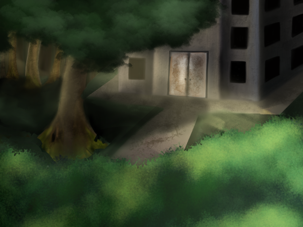
As instructed by my director I started developing the background based on her original design. However, at this stage of developing it I realised I didn’t like how the overall composition looked. I had to ask my director to change this piece so it would look better once we add it to the animation.
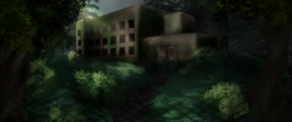
After talking to my director about changing the piece I started my own research into building architecture for hospitals as well as asylums as I wasn’t 100% sure which architecture style we were looking for. Once again after conversing with my team mates it was decided to focus on older looking hospitals. Taking this forward I started developing the hospital building first as it was the most important aspect of the piece. I decided to make the building feel as though it was on a slight hill so that it was almost as if our main character had chosen to walk up that path towards the building and had chosen his fate in the process. I tried to incorpret more textures within the environment elements as well as on the building. Looking back at this piece I feel as though I could’ve developed the textures on the building further to give it more dimension. One element I did like within this piece was the shadow of the fence. The scene before includes our main character climbing under the fence to get to this hospital, I though the shadow of the fence would help tie the scenes together.
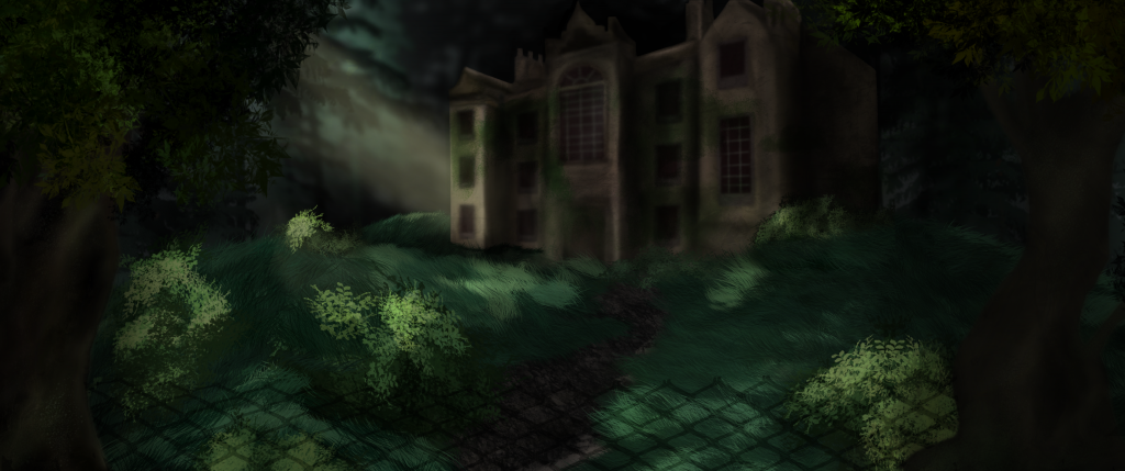
We received feedback that the original building was too plain and boxy. Reflecting on this I suggested to the team if we change it to look more like an asylum building in which they agreed. I then redesigned the building to make the overall building look more grand. I decided not to add a tonne of detailing carved into the building as the audience wouldn’t be able to see it. I personally think the bigger building works a lot better within the piece although I wish I made some of the edges of the building more sharp instead of my usual soft style so it stood out a little bit more. Additionally, looking back on the piece I should have experimented with the light intensity as I think it is slightly too soft.
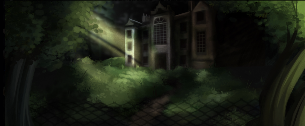
It was decided from my director that she was going to alter elements within the scene. My director said it was to match the style of the rest of the forest scenes. I wish I could’ve been offered the opportunity to edit it but it wasn’t communicated to me that the style of the original was an issue when I first created it at the start of production. Additionally, I wasn’t asked to update the style either. Alternatively, I’m not too bothered with the changes as the main building was only slightly altered and still based on my original design.