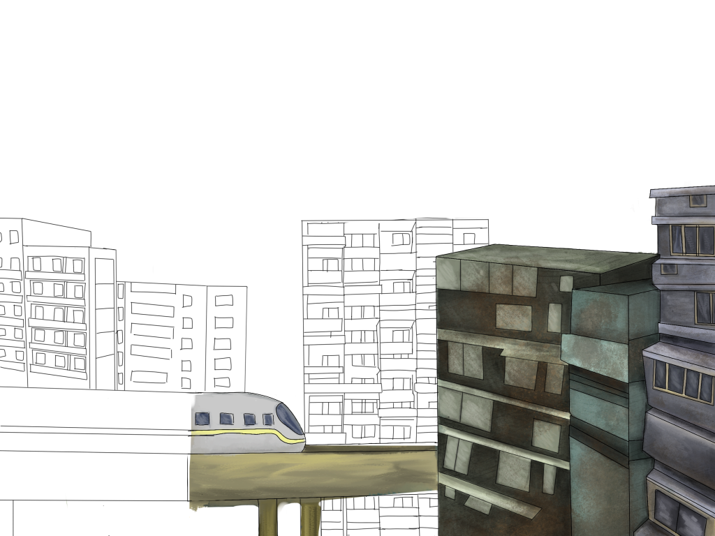
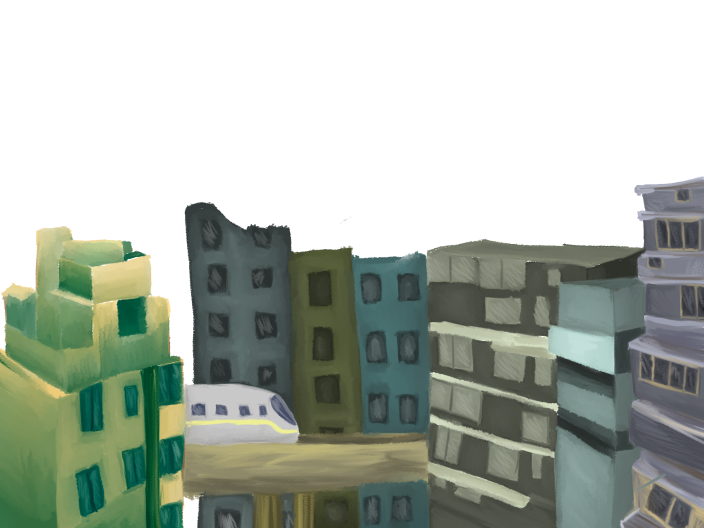
For this drawing I started with the line work of the general buildings I want to include. I added some basic colouring to get a better understanding of the colour pallete I might use for the rest of the piece. However, when looking at this piece I might change some of the shapes of the buildings as they all look quite similar and some are looking flat. First development for my present drawing. I started drawing all these buildings focusing on more run down building’s to give that abandoned look to my piece. However, when looking at this perspective I don’t like it as much. I also think the buildings in the background I originally wanted to use will get lost so I need to change the perspective of this piece. In addition, the building on the far left I tried a slightly warmer pallet to see with I could blend the two together but I think it stands out to much and either I will have to recolour it or change the building completely.
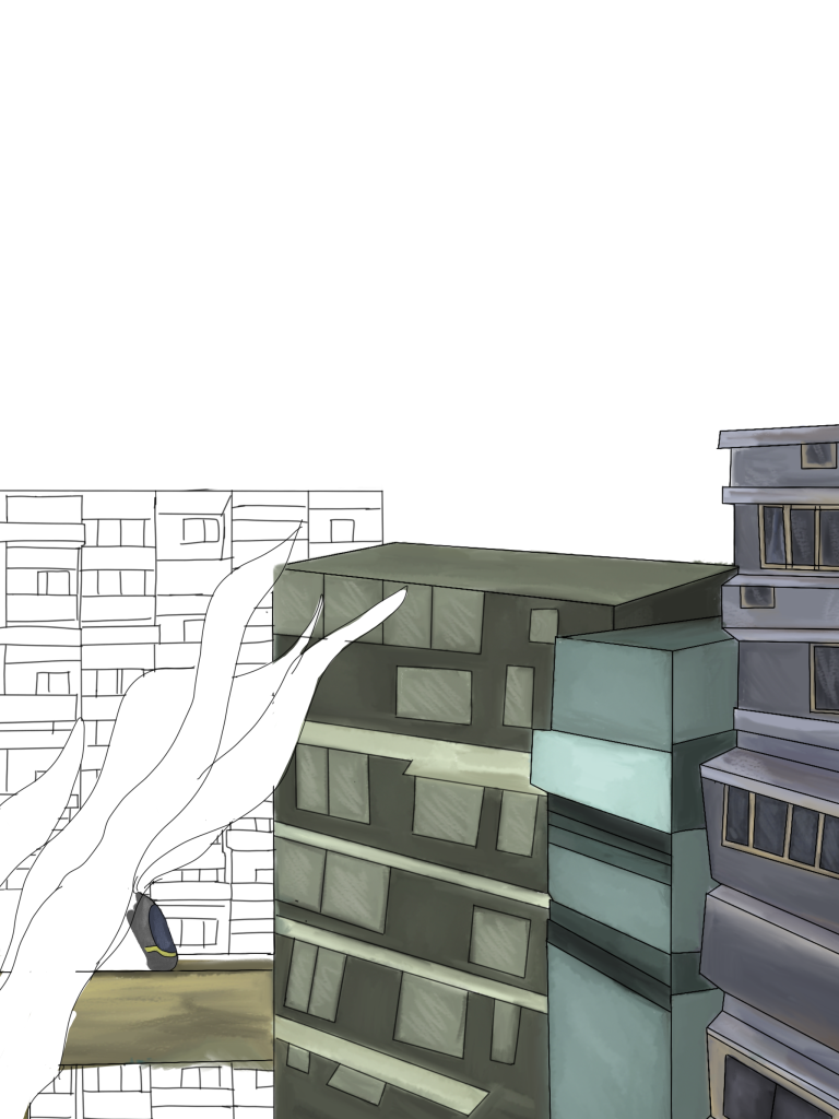
I like the perspective a lot more within the piece and adding more sea vegetation adds to the underwater sunken situation I want to come across. I think once the colouring is done I will get rid of the outlines as it takes away from the painterly effect I want to portray and it makes it look more flat with the outlines of the buildings.
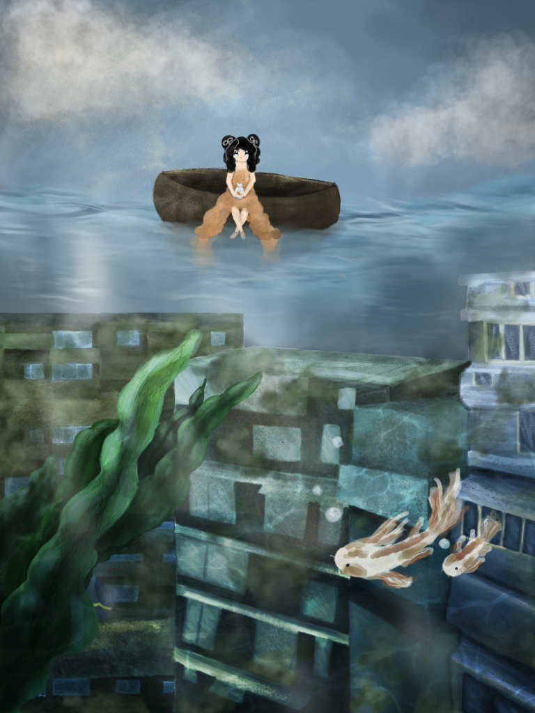
My final outcome came out better then I hoped for. I love this concept of her being lost at see with her pet goldfish not knowing what lies underneath the water. I think this composition works a lot better and the colour pallet matches more. I think the details defiantly paid off in the end especially making a brush tool to create the water light lines.